How We Redesigned the Catalogue to Help Learners Find Content Faster

Cormac O'Dwyer
Product Manager
Reading Time:
Lead the pack with the latest in strategic L&D every month— straight to your inbox.
SubscribeAt the end of last year, the team was knee-deep in customer interviews. We wanted to understand where learners were getting stuck in our platform—not just what buttons they were clicking, but how it felt actually to use the thing day-to-day.
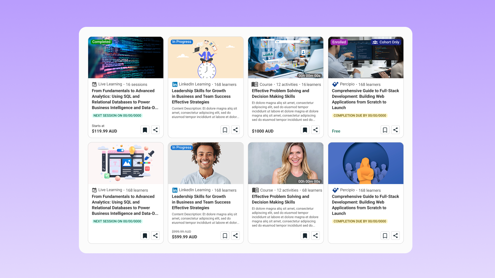
One area was flagged a few times over: the catalogue.
Learners told us they were bouncing between internal content and external libraries like LinkedIn Learning or Go1, losing track of what they’d seen. Search results felt like a phone book, not a tool for discovery. And preview pop-ups, instead of helping, just added another click before getting to the good stuff.
When you hear the same pain points echoed across organizations, you can’t ignore them. So, we rebuilt the catalogue with a simple focus: less friction, faster access to learning that matters.
What’s new
We focused this redesign on one principle: the catalogue should help learners move forward, not slow them down. That meant rethinking how search works, how results are sorted and filtered, and how the whole experience feels to navigate.
The goal wasn’t more features; it was fewer barriers between a learner and the moment they start learning.
One search for all content
Before, learners had to choose between searching internal content or third-party libraries. That separation made discovery harder than it needed to be.
Now, everything shows by default. One search, full picture.
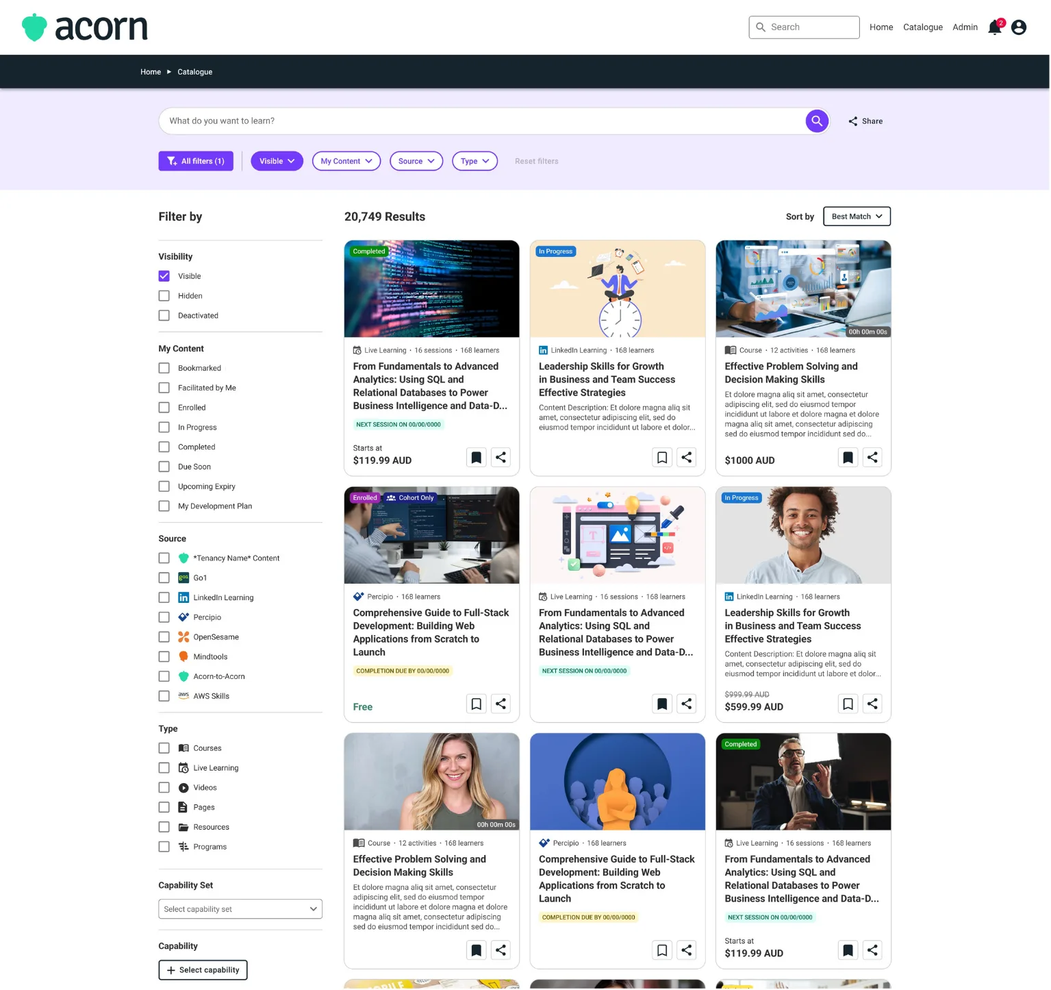
For learners, it means no wasted time switching between silos. For admins, it means the investment you’ve made in external libraries is surfaced alongside your internal IP.
More ways to sort
Alphabetical order works in some cases, but it isn’t the fastest way to scan a growing library.
We’ve added “Newest” and “Z–A” options, with more sorting methods on the way.
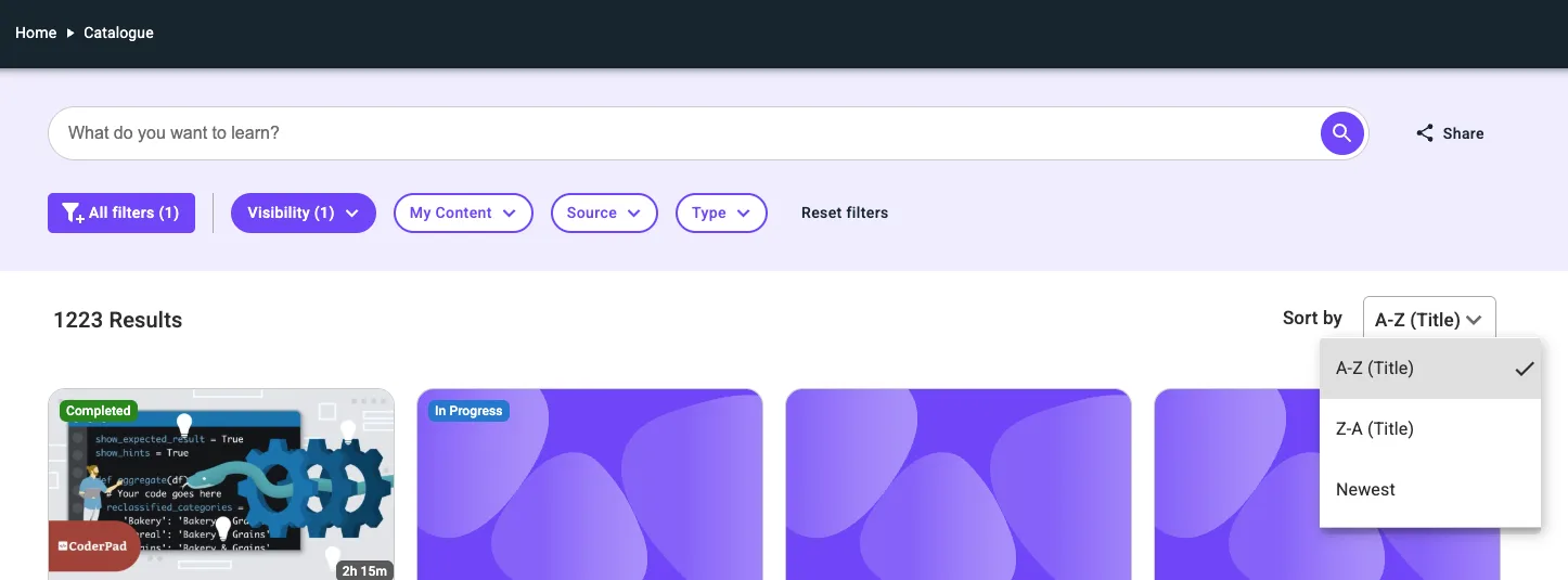
Learners can now surface the latest content as soon as it’s added or flip the view to scan titles in reverse order. Simple, flexible, and under their control.
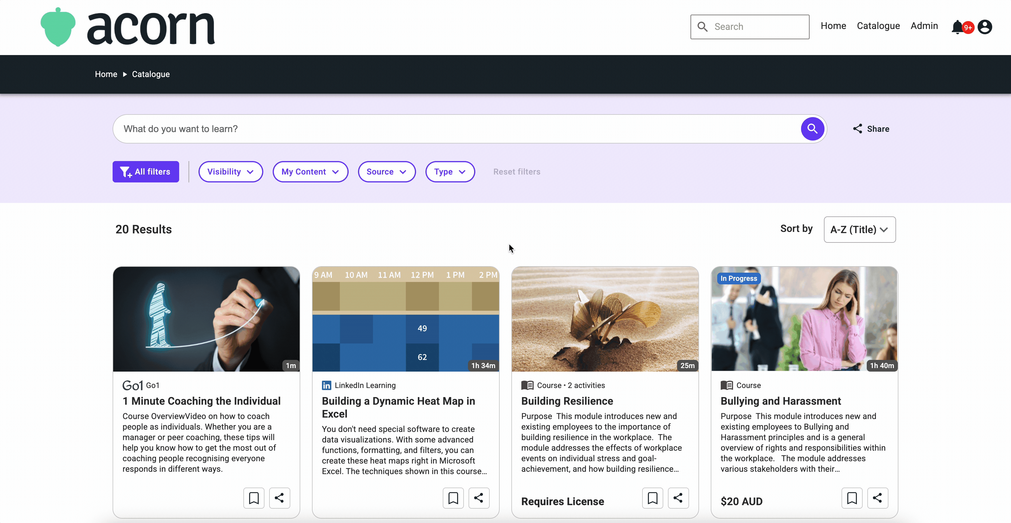
Obvious filters
Filters are most useful when they’re easy to spot and simple to use. We’ve updated their design to make them clearer and more intuitive.
Now it’s faster to refine results and get from a broad list to the specific content a learner needs.
Straight to the point content
The preview modal was designed to give learners a snapshot before committing. What we learned from feedback is that it often added an extra step.
Now learners can open content directly, and if it’s not the right fit, they’ll land back exactly where they left off in their search results.
That means fewer clicks, less interruption, and faster movement from search to study.
A catalogue that looks like it belongs in 2025
Design isn’t just decoration. It’s how people move through information without friction.
We’ve given the visuals and navigation a refresh with cleaner layouts, clearer hierarchy, and modern navigation. It’s now easier to scan through and get where you need to go.
What’s next
We’re not done. Two more upgrades are on our to-do list:
- Smarter search. Results that do a better job of surfacing what learners actually need, with fewer dead ends.
- A “Most Relevant” sort option. So the best-fit content rises to the top automatically.
Both come back to the same principle that drove this redesign: learners shouldn’t spend more time searching than learning.
That’s the standard we’re holding ourselves to, and these changes are just the next step in getting there.
As a reminder, this will only be available as a preview to existing customers in October. The new catalogue will be fully rolled out in November.